reading-notes
CSS | Website Layout
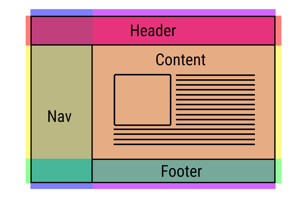
A website can be divided into various sections comprising of header, menus, content and footer based on which there are many different layout design available for developer. Different layouts can be created by using div tag and use CSS property to style it.
Header section contains a website logo, a search bar and profile of user. The navigation menu contains link to various categories of articles available and content section is divided into 3 parts(columns) with left and right sidebar containing links to other articles and advertisements whereas the main content section is the one containing this article, then at the bottom there is a footer section which contains address, links, contacts etc.

Header Section: The header section is generally placed either at the top of the Website or just below a top navigation menu. It often comprises of the name of the Website or the logo of the Website.
Navigation Menu: A Navigation Bar/Menu is basically a list of links that allows visitor to navigate through the website comfortably with easy access.
Content Section: The content section is the main body of the website. The user can divide content section in n-column layout. The most common layouts are:
1-Column Layout: It is mostly used for mobile layout.

2-Column Layout: This website layout is mostly used for tablets or laptops.

3-Column Layout: This website layout is mostly used for desktops.

The user can also create a responsive layout where the layout will get changed as per screen size. Consider the below example where if width of screen is more than 600px then there will be 3-column layout and if width of screen is between 400px to 600px then there will be 2-column layout and if screen size less than 400px then 1-column layout will display.